Reimagine
Ikea
the prompt
Reimagine an existing brand and create a new and unique Digital design and brand strategy. Cross-device interactions, interactive prototypes, and micro-interactions are encouraged.
role
Solo project for Visual Design studio at UMD
tool box
Sketch, Principle, Invision, Photoshop
timeframe
3 weeks
strategy
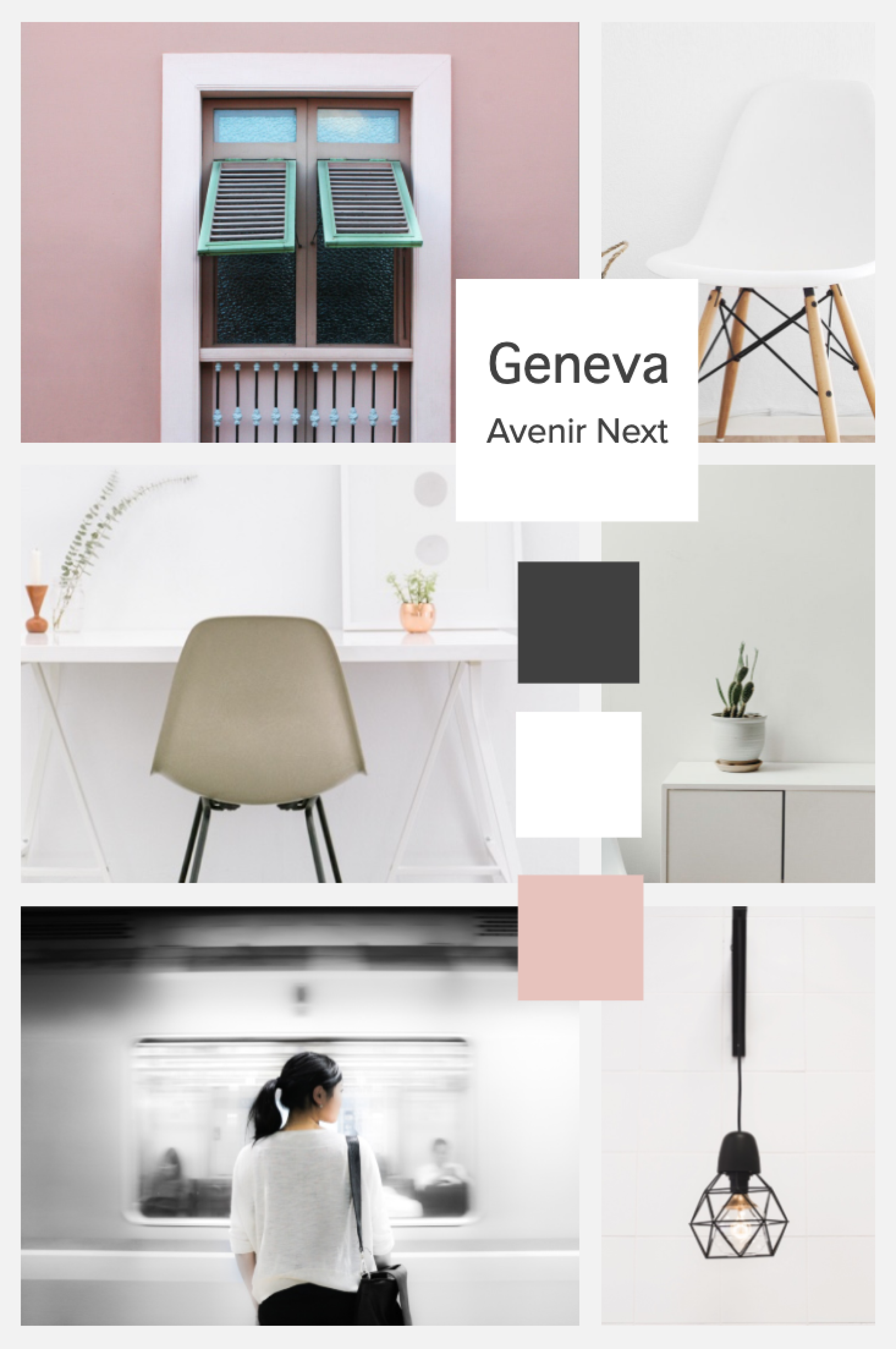
Ikea's Scandinavian elegant in-store experience doesn't fully translate into their digital experiences. So I picked Ikea's mobile experience for this project with an intention to reimagine and elevate their digital presence in a more elegant direction. First, I looked up Ikea’s mission statement and picked up some themes from their concept to re-imagine and re-define the look and feel.
The IKEA Concept starts with the idea of providing a range of home furnishing products that are affordable to many people, not just a few. It is achieved by combining function, quality, design, and value - always with sustainability in mind. The IKEA Concept exists in every part of our company, from design, sourcing, packing and distributing through to our business model. Our aim is to help more people live a better life at home. Småland, the landscape where the founder grew up, was stony and rugged. Back then, many of the inhabitants had to get by with small means. Because of this, Smålanders are said to be thrifty and innovative, with a “no-nonsense” approach to everyday problem-solving. This heritage is one explanation for the IKEA way of doing things and to our success.
design principles
Three themes stood out to me from the mission statement.
No-nonsense
Simplicity in layout, easy interactions and information architecture, visual consistency and lots of detail.
Innovative
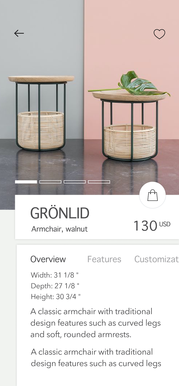
Sleek, modern, and minimal color palette. Fashionable imagery to highlight the products. Service should involve innovation such as replacing paper and pencil with an app or a wearable.
Value
Straightforward, functional products solving a problem without any unnecessary or overwhelming features. Show customers the possibility of a better lifestyle at a low cost.
the experience
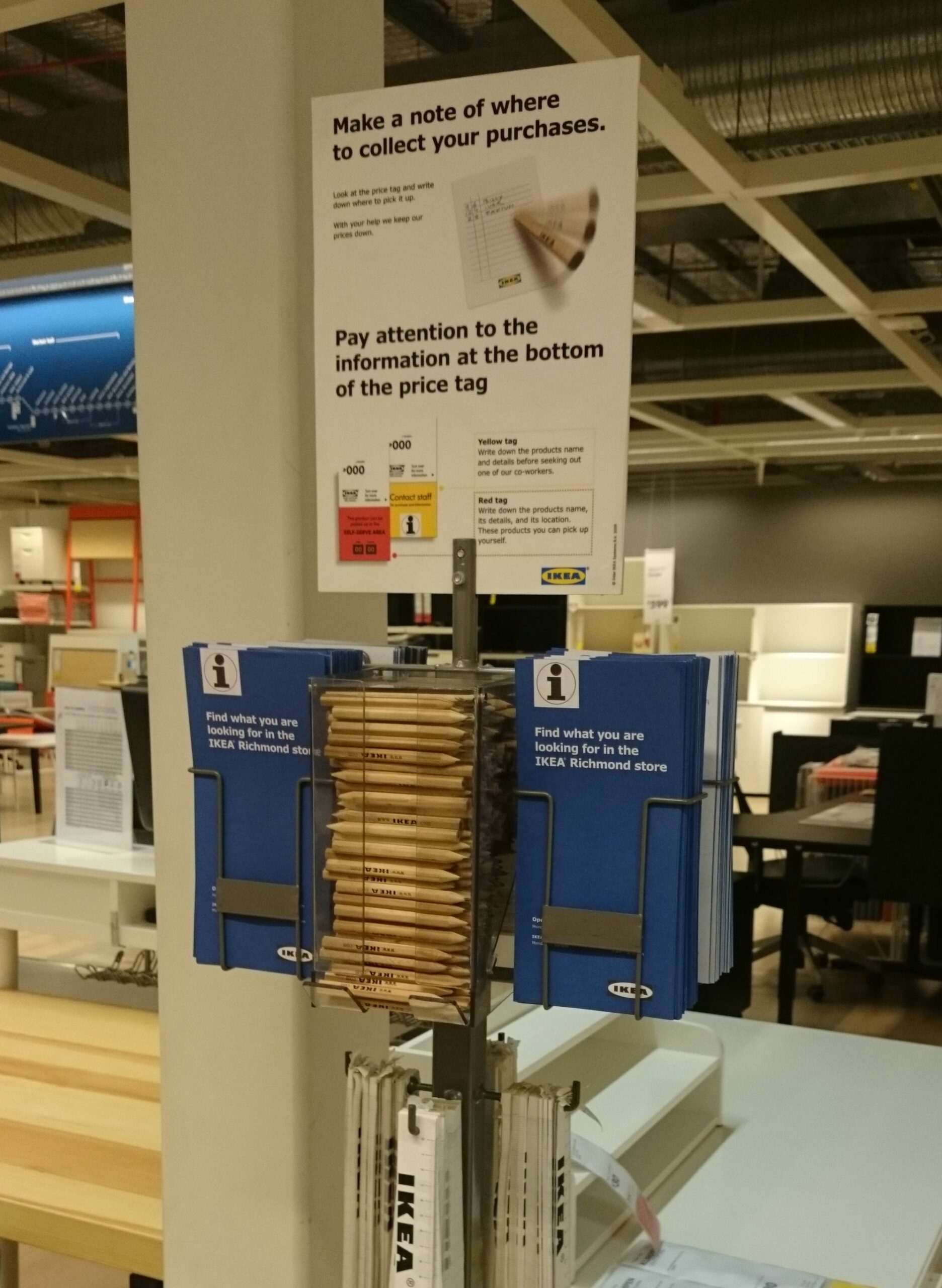
When you walk into an Ikea store, you see pencils and notepads to write down the list of items you want to purchase.
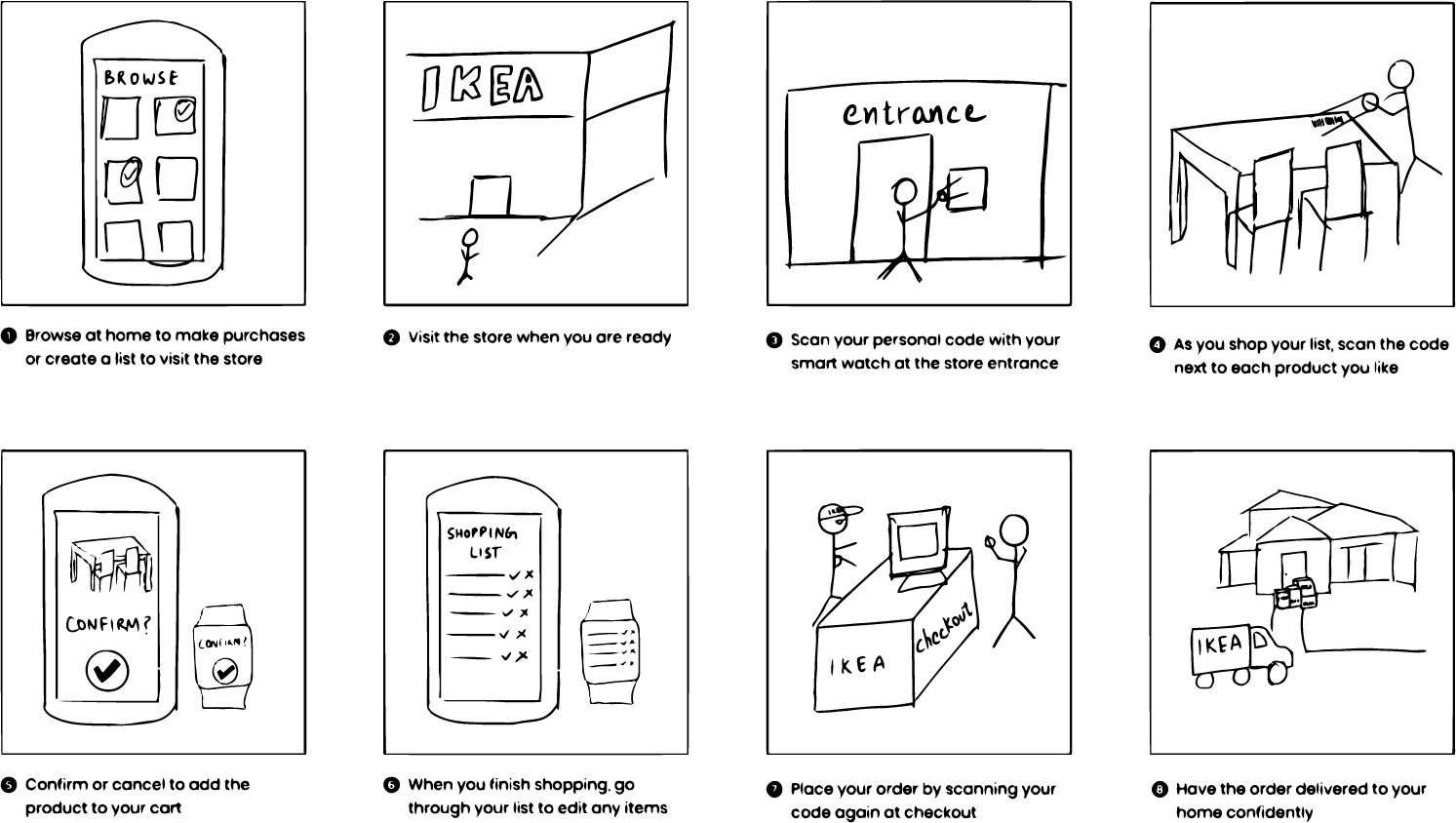
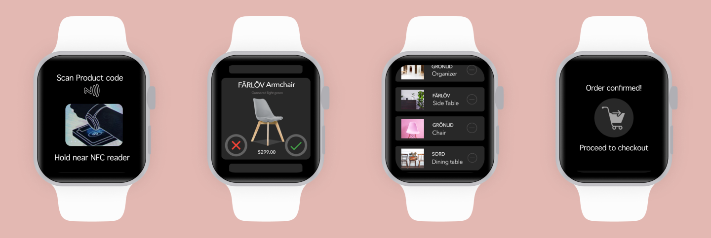
I re-imagined this buying experience and incorporated technology like scannable personal codes, smartwatches, and cross-device solutions.
final watch experience
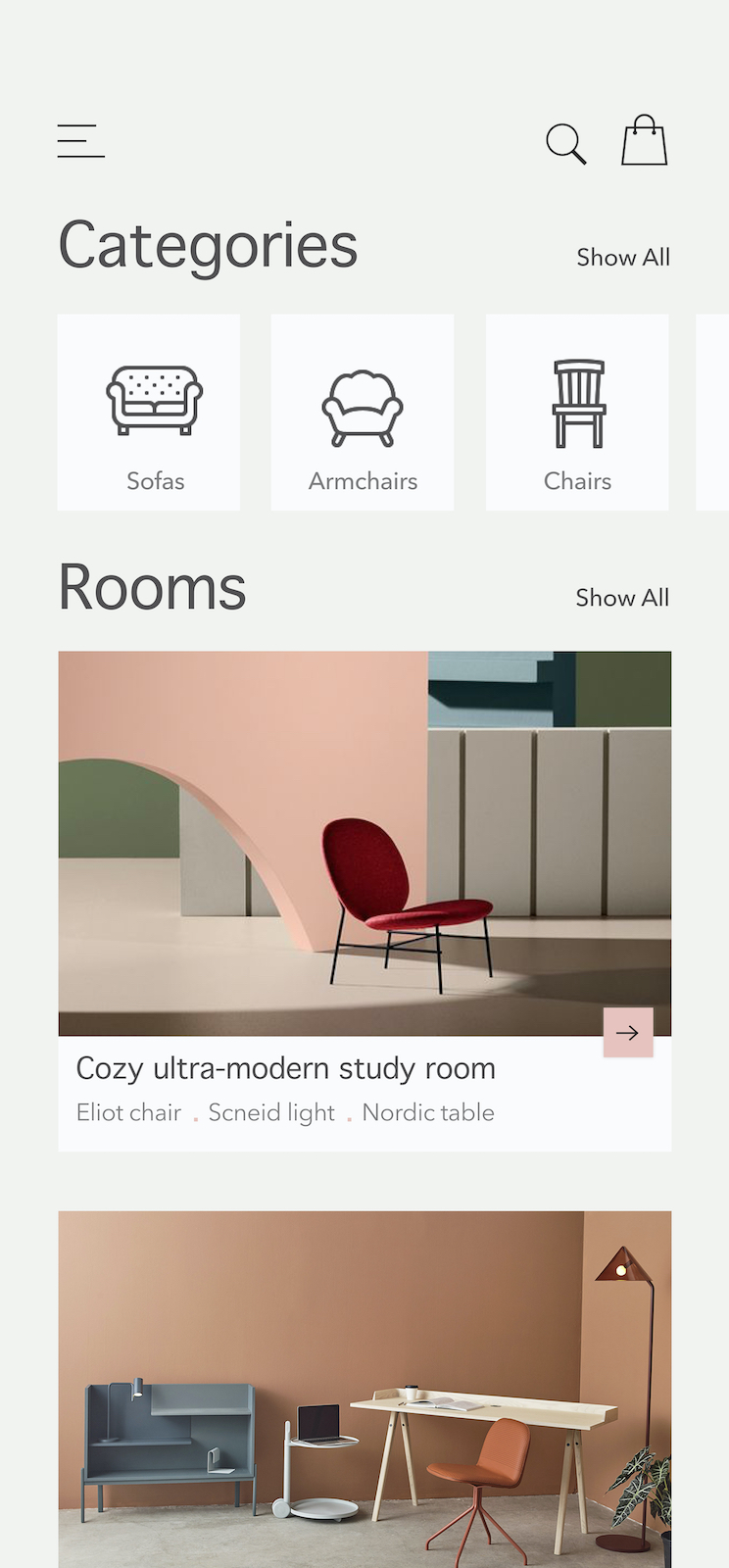
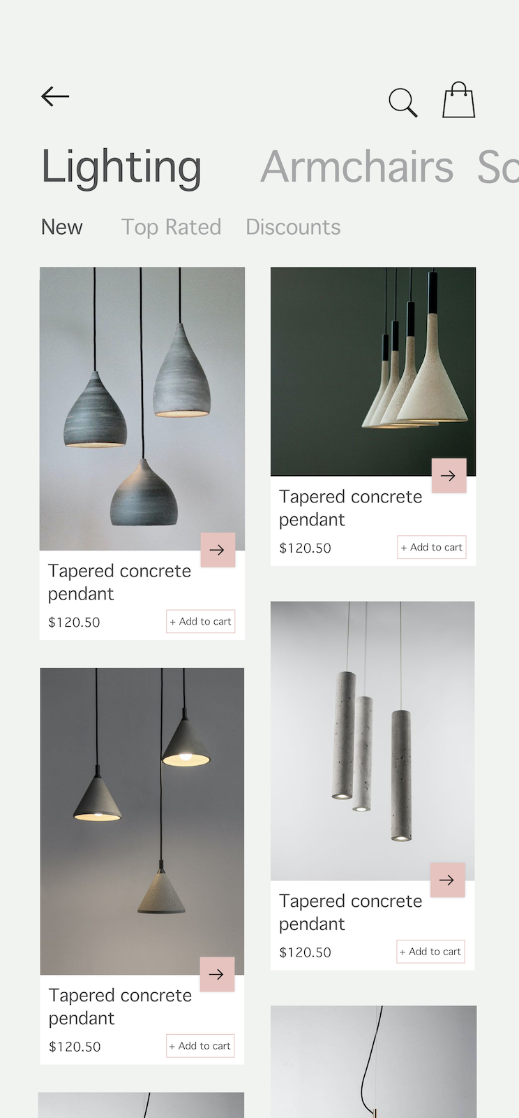
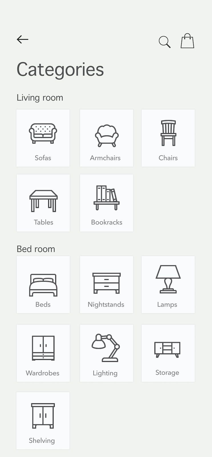
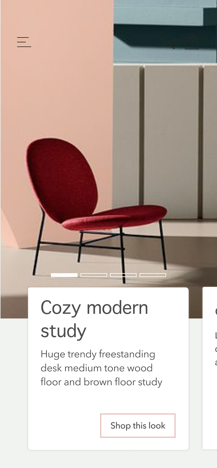
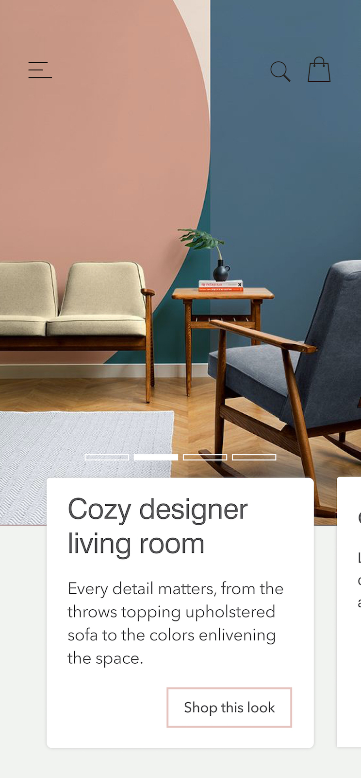
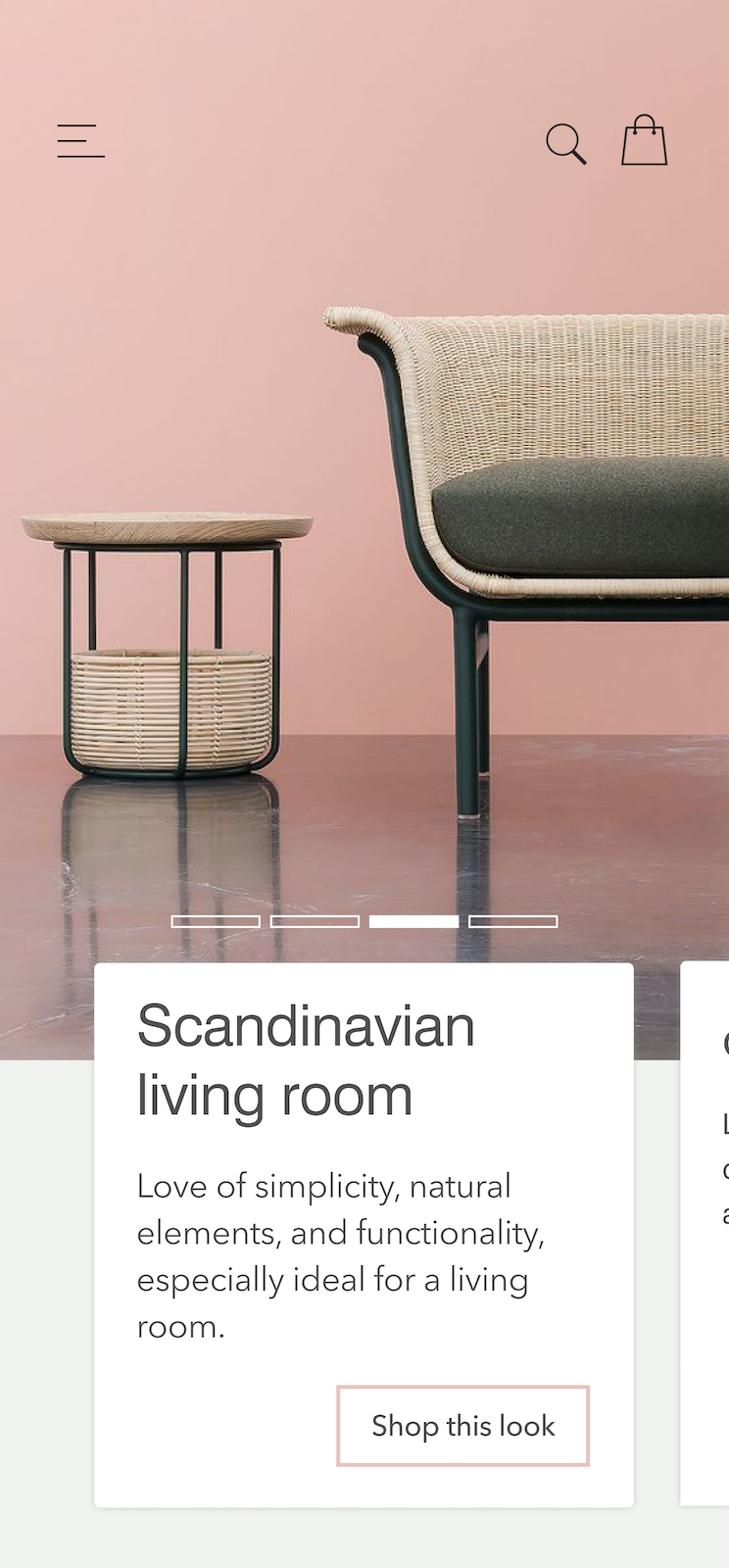
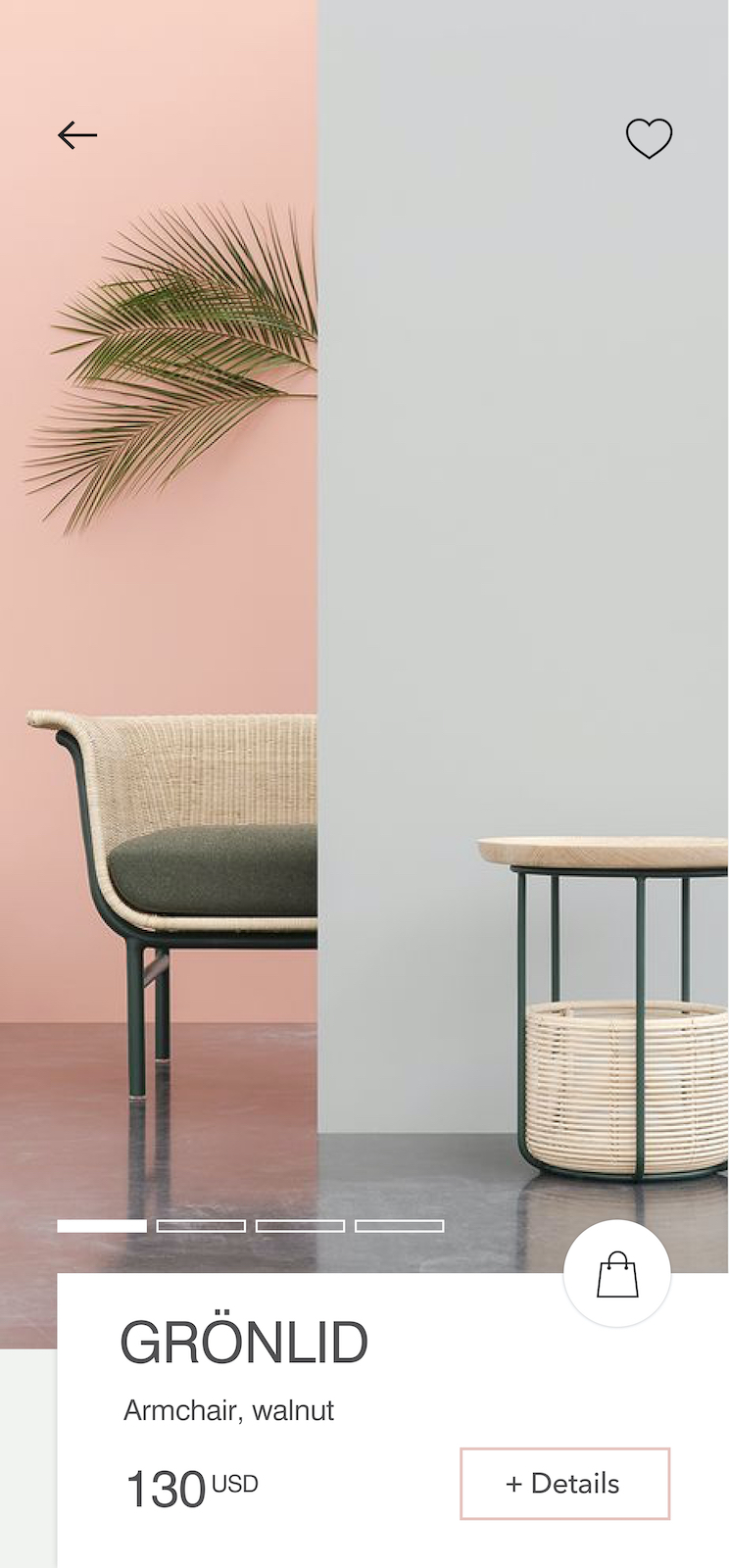
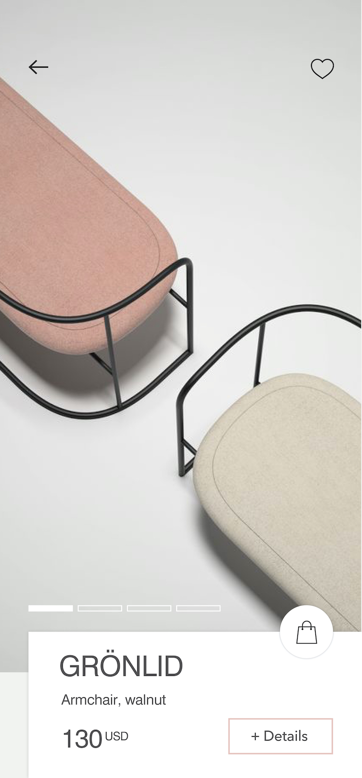
final mobile experience
